



Colours are an essential part of everyday life, influencing how we see the world, express our personalities, and make decisions. From the clothes we wear to the walls of our homes, colours help create visual harmony and communicate feelings without using words. Some shades feel calm and relaxing, while others appear energetic, bold, or sophisticated. Learning the names of different colours makes it easier to describe what we see, choose suitable combinations, and understand the role of colour in art, fashion, technology, and interior design.
The variety of colours available today extends far beyond the familiar shades of red, blue, green, yellow, and black. Each basic colour includes numerous variations, such as navy blue, sky blue, forest green, mint green, coral, burgundy, and lavender. These shades can look different depending on lighting, surrounding colours, screen settings, and the materials on which they appear. Understanding these differences is particularly useful when shopping online, selecting paint, designing graphics, or creating a coordinated outfit.
A practical colour name guide can help beginners, students, designers, and anyone interested in visual creativity build a stronger understanding of colours. By exploring common names, their characteristics, everyday applications, and effective combinations, readers can make more confident choices. Whether the goal is to learn basic colour vocabulary or discover attractive shades for a personal project, understanding the colour spectrum provides a useful starting point.
Understanding Different Colour Names
Colour names are words used to identify and distinguish visual shades. They allow people to communicate specific appearances rather than relying on general descriptions. For example, saying that a dress is blue provides a basic idea, but describing it as royal blue, turquoise, or powder blue gives a much clearer picture. This distinction becomes especially important in fashion, painting, product design, photography, and digital artwork, where small variations can significantly change the overall appearance.
Colours can be grouped into primary, secondary, and tertiary categories. In traditional painting, red, yellow, and blue are commonly taught as primary colours. Mixing these colours creates secondary colours such as green, orange, and purple. Combining neighbouring primary and secondary colours produces tertiary shades, including yellow-green, blue-green, red-orange, and blue-purple. Digital displays use a different system based on red, green, and blue light, which explains why colour mixing can behave differently on a screen compared with physical paint.
Another useful distinction is between warm and cool colours. Warm shades, including red, orange, and yellow, are often associated with sunlight, fire, warmth, and energy. Cool shades, such as blue, green, and violet, are commonly connected with water, nature, freshness, and tranquillity. These associations are not universal, but they can help people understand why certain colours are chosen for particular environments, products, and creative projects.
Popular Colour Names and Their Characteristics
There are hundreds of commonly used colour names, and many have developed from nature, precious materials, flowers, foods, and cultural traditions. Understanding a few major colour families makes it easier to identify related shades and select appropriate colours for different purposes.
Red and Its Popular Shades
Red is a strong, attention-grabbing colour frequently associated with passion, energy, celebration, and urgency. It appears in clothing, decorative accessories, advertising, sports uniforms, and festive decorations. Bright red creates a vivid impression, while darker variations can appear elegant and dramatic.
Popular shades include scarlet, crimson, burgundy, maroon, cherry red, ruby red, and brick red. Scarlet is generally bright and intense, whereas burgundy and maroon are deeper shades that often suit formal clothing and sophisticated interiors. Coral red introduces a softer, warmer appearance, making it useful for summer fashion and decorative accents.
Blue and Its Popular Shades
Blue is widely used in clothing, corporate branding, home decoration, and digital interfaces. It is often associated with trust, stability, calmness, and openness. Lighter shades can make a room feel airy, while darker shades create a more formal and grounded atmosphere.
Common variations include navy blue, royal blue, sky blue, powder blue, turquoise, teal, and cobalt blue. Navy blue works well with white, beige, and grey, making it a popular choice for professional clothing. Sky blue is lighter and more relaxed, while turquoise combines blue and green characteristics to create a fresh, lively appearance.
Green and Its Popular Shades
Green is strongly connected with plants, forests, gardens, and the natural environment. It can introduce freshness into a design and works well in spaces intended to feel comfortable and balanced. Green also appears frequently in packaging and branding associated with gardening, sustainability, and outdoor activities.
Popular green shades include mint green, olive green, emerald green, lime green, sage green, forest green, and sea green. Emerald green offers a rich, jewel-like appearance, while sage green is muted and subtle. Olive green pairs naturally with cream, brown, and other earthy shades, whereas lime green creates a brighter and more energetic visual effect.
Yellow and Orange Shades
Yellow is commonly associated with sunshine, optimism, warmth, and visibility. Its brighter variations attract attention, while softer tones can produce a gentle, welcoming appearance. Yellow is often used in decorative accents, children’s products, seasonal designs, and warning signs where visibility matters.
Orange combines the warmth of red with the brightness of yellow. It often appears playful, lively, and inviting. Popular variations include amber, peach, apricot, tangerine, burnt orange, and pumpkin orange. Peach is softer and more delicate, while burnt orange provides a deeper, earthy tone suitable for autumn-inspired interiors and clothing.
Purple, Pink, and Neutral Shades
Purple and pink offer a wide range of visual styles, from delicate and romantic to bold and luxurious. Lavender and lilac are pale purple shades often used in spring clothing, floral arrangements, and relaxing interiors. Violet is generally more vivid, while plum and eggplant create darker, richer effects. Pink variations include blush pink, baby pink, rose pink, hot pink, and dusty pink.
Neutral colours are equally important because they provide balance and allow other shades to stand out. White, black, grey, beige, ivory, taupe, and cream are frequently used in minimalist design, professional clothing, furniture, and home decoration. Their versatility makes them valuable choices when a design needs to remain coordinated without appearing overly colourful.
A Helpful Table of Common Colours
The following table provides an overview of popular colours, their typical visual characteristics, and some practical applications. These descriptions are general guidelines because colour perception can vary with lighting and context.
| Colour family | Common shades | Typical applications |
|---|---|---|
| Red | Crimson, scarlet, burgundy | Fashion, celebrations, highlights |
| Blue | Navy, sky blue, royal blue | Offices, clothing, digital design |
| Green | Sage, emerald, olive | Interiors, gardens, branding |
| Yellow | Lemon, mustard, golden yellow | Decorations, accents, displays |
| Orange | Peach, amber, terracotta | Seasonal design, fashion, packaging |
| Purple | Lavender, violet, plum | Artwork, accessories, interiors |
| Pink | Blush, rose, coral pink | Clothing, floral designs, cosmetics |
| Neutral | White, black, beige, grey | Backgrounds, furniture, formal styles |
How Colours Are Used in Everyday Life
Colours influence many practical decisions, including what people wear, how rooms are decorated, and how products are presented. In fashion, colour selection can help create a consistent appearance for different occasions. Neutral shades such as black, navy, grey, and beige are easy to coordinate, while brighter colours introduce personality and contrast. A navy jacket with a white shirt, for example, creates a classic combination, whereas a mustard accessory can add warmth without overwhelming the outfit.
In interior design, colours help establish the character of a room. Soft whites, pale blues, and light greens can make a space feel open and fresh, while deep green, navy, and burgundy can create a more intimate atmosphere. However, the final effect depends on furniture, lighting, room size, and the amount of each colour used. A small room with limited natural light may benefit from lighter wall shades, although carefully placed darker accents can also add depth.
Colours are also essential in digital products and websites. Designers use contrasting shades to make buttons, headings, navigation elements, and important information easier to recognise. A colour that looks attractive on its own may become difficult to read when placed against a similar background. Good design therefore considers contrast, consistency, and accessibility rather than choosing colours purely for appearance.
How to Choose the Right Colour Combination
Selecting colours becomes easier when you understand how shades relate to one another. Some combinations create strong contrast, while others produce a more subtle and coordinated appearance. The best choice depends on the purpose of the design, the intended audience, and the mood you want to communicate.
Complementary colours sit opposite one another on a traditional colour wheel. Examples include blue and orange, red and green, and yellow and purple. These combinations can create visual energy, especially when one colour is used as the dominant shade and the other is reserved for smaller accents. Using both colours at maximum intensity across a large area, however, may make a design feel overwhelming.
Analogous colours sit next to one another on the colour wheel, such as blue, blue-green, and green. These combinations often appear harmonious because the shades share similar visual characteristics. Monochromatic combinations use different lightness and saturation levels of a single hue, such as pale blue, medium blue, and navy. This approach is particularly useful for minimalist interiors, coordinated outfits, and clean graphic designs.
A few simple principles can help when planning colour combinations:
-
Start with one main colour and select supporting shades around it.
-
Use neutral colours to balance bright or highly saturated shades.
-
Check the combination under the lighting in which it will be used.
-
Consider text readability and accessibility when designing digital content.
These principles provide a useful foundation, but experimentation remains important. Small samples, digital mock-ups, and fabric swatches can reveal differences that are difficult to judge from a colour name alone.
The Importance of Colour Names in Digital Design
Digital design has made colour identification more precise and more complex. On a computer or mobile screen, designers can select colours using hexadecimal codes, RGB values, and HSL values. These systems describe colours numerically, allowing a particular shade to be reproduced more consistently across design files and digital projects.
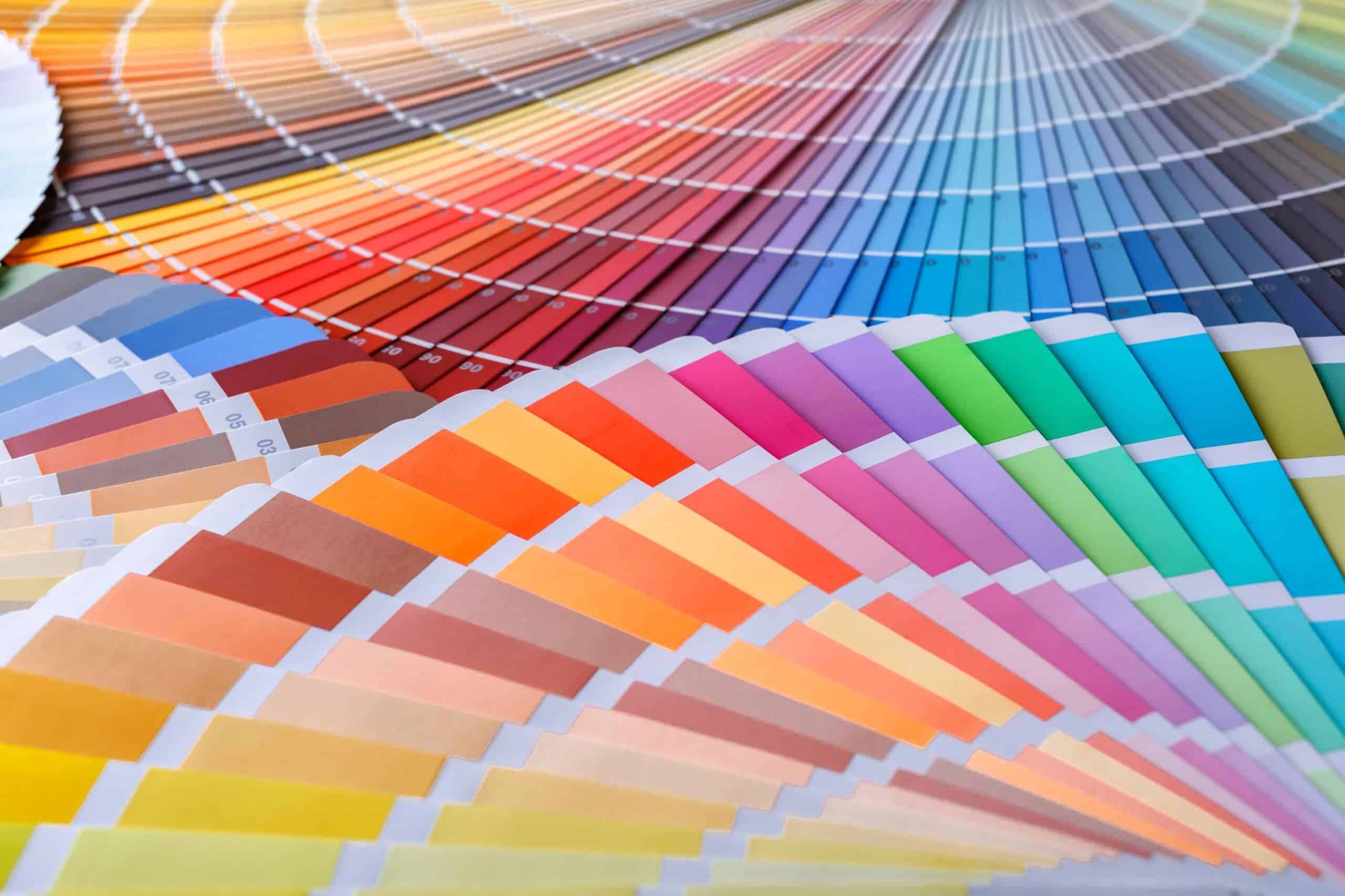
For example, a designer might choose a deep navy shade for a website background and a lighter blue for buttons or secondary elements. Recording the exact colour values helps maintain consistency across different pages. Named shades still play an important role because they make discussions easier, but numerical values are often necessary when precise reproduction matters.
However, identical numerical values do not always appear exactly the same on every device. Screen calibration, display technology, brightness, and surrounding conditions can influence the appearance of a shade. Printed materials introduce additional differences because ink and paper behave differently from light emitted by a screen. For projects requiring accurate brand colours or product matching, testing the final output is more reliable than depending entirely on a name.
Common Mistakes When Selecting Colours
One common mistake is assuming that a colour name represents a single, universally agreed shade. Terms such as teal, aqua, turquoise, and sea green can overlap, and different manufacturers may use the same name for slightly different colours. This can create confusion when ordering paint, purchasing clothing, or matching accessories. Looking at an actual sample or a clearly defined digital value helps reduce uncertainty.
Another mistake is choosing too many strong colours without establishing a visual hierarchy. When every element competes for attention, the overall design can become difficult to understand. A more effective approach is to select a dominant colour, introduce one or two supporting shades, and use accents selectively. This creates a clearer visual structure and makes important elements easier to notice.
Ignoring lighting is another frequent problem. A warm indoor light can make certain shades appear more yellow or orange, while daylight may reveal cooler undertones. The same paint sample can therefore look different in a shop, beside a window, and under evening lighting. Testing samples in the intended environment is a practical way to avoid disappointing results.
Conclusion
Understanding colour names is useful for much more than identifying shades. It helps people communicate visual ideas clearly, coordinate clothing, decorate homes, develop creative projects, and make informed decisions about digital design. From vivid scarlet and royal blue to understated sage green and warm beige, each colour family offers different possibilities depending on the setting and the desired effect. The most effective way to develop colour knowledge is to observe shades in real environments, compare related variations, and experiment with different combinations. Paying attention to contrast, lighting, materials, and personal preferences can make colour selection more practical and enjoyable. With a stronger understanding of the colour spectrum, anyone can choose shades more confidently and create combinations that are attractive, balanced, and appropriate for their purpose.